
In a digital world overflowing with information, attention is the most valuable currency. Readers scroll fast, skim often, and rarely stop unless something truly catches their eye. This is exactly where infographics shine. They turn complex ideas into visually engaging stories that people actually want to consume and share. But creating a beautiful visual alone is not enough. Without the right strategy behind it, even the best infographic can disappear into the noise.
This guide is designed to walk you through both sides of the equation: how to create compelling infographic designs and how to make sure they reach the right audience. When infographic design & content distribution tactics work together, they can dramatically boost engagement, brand recall, and organic reach. The key is balance. You do not want to stuff content with keywords or focus only on visuals without a promotion plan. Instead, you need a thoughtful, human-centered approach that prioritizes clarity, storytelling, and smart distribution.
Whether you are a marketer, blogger, or business owner, this article will help you understand how to transform data into visual content and distribute it in a way that delivers real results. From planning and design principles to promotion methods and practical use cases, consider this your complete roadmap.
Understanding the Power of Visual Storytelling
Humans process visuals far faster than text. A well-crafted infographic can communicate an idea in seconds that might otherwise take several paragraphs to explain. This makes infographics especially useful for data-heavy topics, step-by-step processes, comparisons, and trends.
What makes them powerful is not just color and layout, but storytelling. Strong infographic design and content distribution tactics start with a clear message. Before thinking about fonts or charts, you should know exactly what story you want to tell and what action you want the reader to take after viewing it. When visuals guide the reader naturally from one point to the next, the content feels intuitive rather than overwhelming.
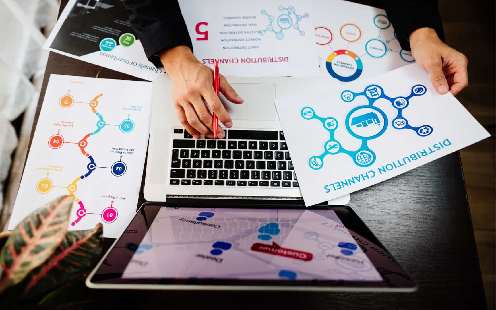
Infographic Design & Content Distribution Tactics: Prior to Designing, Plan
Great infographics are born long before the design phase begins. Planning is where most creators either succeed or fail. Start by identifying your target audience. What problems are they trying to solve? What level of knowledge do they already have? This helps determine how detailed or simplified your infographic should be.
Next, focus on your data. Use credible sources and verify accuracy. Even the most attractive infographic loses value if the information is misleading or outdated. This is also the stage where many professionals consider using an infographic design & content distribution tactics template to organize ideas, sections, and flow before moving into design tools. Templates can help maintain structure while still leaving room for creativity.
Core Design Elements That Matter
Design is not about decoration. It is about communication. Every visual element should serve a purpose. Color palettes should be consistent and aligned with the message, not distracting. Typography should be readable, even on smaller screens, since many people view infographics on mobile devices.
Spacing and hierarchy are equally important. Clear sections, headings, and visual cues help guide the reader’s eyes. Icons and charts should simplify information, not complicate it. Many infographic design and content distribution tactics examples fail because they try to cram too much information into one visual. Simplicity always wins.
Making Content Easy to Scan
People rarely read infographics from top to bottom like a blog post. They scan. That means your content needs to be broken into digestible chunks. Short text blocks, bullet-style facts, and visual separators make a big difference.
Use numbers, percentages, and comparisons strategically. When done right, they create immediate impact. This is also where storytelling comes into play again. Each section should logically connect to the next, creating a smooth visual journey rather than a collection of random facts.
Choosing the Right Format
Not all infographics are created equal. Some work best as long vertical visuals for blogs, while others perform better as bite-sized graphics for social platforms. Your format should align with your distribution goals.
For example, a detailed guide might later be repurposed into an infographic design and content distribution tactics PDF for downloads or lead generation. Shorter versions can be adapted into social posts or presentation slides. Thinking ahead about format saves time and extends the life of your content.
Distribution Is Where Impact Happens
Effective distribution is crucial for the success of infographics, as visibility determines performance. Begin by publishing the infographic on a high-traffic, relevant page of your website, accompanied by contextual supporting text. Social media serves as a significant amplifier, with each platform necessitating tailored approaches. Vertical visuals are suitable for scrolling platforms, while segmented visuals appeal to quick-interaction environments.
Email marketing can also boost engagement; incorporating infographics in newsletters can notably enhance click-through rates. Additionally, strategic outreach to bloggers, journalists, or industry creators for backlink opportunities and wider exposure is recommended, emphasizing relevance and personalization over broad outreach strategies.
FAQs
What are the 5 rules of infographics?
The five basic rules include having a clear purpose, keeping the design simple, using accurate and reliable data, maintaining visual hierarchy, and focusing on readability. When these elements work together, the infographic becomes easier to understand and more engaging for the audience.
How can you refine a content distribution strategy?
Refining a distribution strategy involves analyzing performance data, identifying which channels deliver the best results, and adjusting your approach accordingly. Consistent testing, audience feedback, and repurposing successful content formats help improve reach and engagement over time.
What is the main purpose of the infographic?
The main purpose of an infographic is to simplify complex information and present it in a visually engaging way. It helps readers quickly grasp key insights, trends, or processes without needing to read long blocks of text.
What makes an infographic design effective?
An effective infographic design balances visuals and content. Clear structure, strong visual flow, readable fonts, and relevant data all contribute to making the message easy to understand and memorable for the viewer.
What are the main features of an infographic?
Key features include a clear headline, concise text, visual elements like icons or charts, consistent color usage, and a logical flow of information. Together, these features help communicate ideas efficiently and attract attention.
Repurposing for Long-Term Value
One infographic can fuel multiple pieces of content. Break it into smaller graphics, turn data points into short posts, or expand sections into blog articles. This approach maximizes return on effort while keeping your messaging consistent.
You can find original ideas for repurposing without copying by using “infographic design & content distribution tactics examples” as a source of inspiration. The goal is to adapt, not duplicate. Each format should feel native to the platform it appears on.
Measuring What Works
Tracking performance is essential for improvement. Pay attention to engagement time, referral traffic, and conversions. These metrics tell you whether your infographic is actually delivering value.
Over time, patterns will emerge. You may find that certain topics, formats, or distribution channels consistently perform better. Use these insights to refine future strategies rather than starting from scratch each time.
Avoiding Common Mistakes
One of the biggest mistakes is overloading visuals with text. Another is focusing too heavily on keywords at the expense of readability. While it is important to naturally include terms like infographic design and content distribution tactics within your content, forcing them into every sentence can make the article feel robotic.
Another common issue is ignoring mobile optimization. If your infographic is unreadable on a phone, you are losing a significant portion of your audience. Always test across devices before publishing.
Staying Consistent Without Being Repetitive
Consistency builds recognition. Using similar design styles, color schemes, and tone across infographics helps audiences associate the content with your brand. At the same time, avoid repeating the same structure or ideas too often. Fresh perspectives keep people interested.
This balance is easier to maintain when you use flexible frameworks rather than rigid rules. A well-thought-out infographic design and content distribution tactics template can guide structure while allowing creativity to shine.
In the end, infographic design & content distribution tactics PDF: infographics sit at the intersection of creativity and strategy. When designed with intention and distributed thoughtfully, they can become one of the most powerful content assets in your marketing toolkit. The secret is not chasing trends or overloading content with keywords, but focusing on clarity, value, and audience needs. By combining strong visual storytelling with smart promotion methods, you create content that does more than look good. It informs, engages, and spreads. That is the true goal of effective infographic design and distribution.


