
Picture this. A potential customer visits your website from their phone during their morning commute. The layout is clunky, text overlaps, and images take ages to load. Within seconds, they tap away and you lose a potential sale. Now imagine the same person landing on a smooth, perfectly scaled site that adjusts beautifully to their screen size. They stay, browse, and maybe even make a purchase. That is the power of responsive web design. In today’s world, a website is often the first impression a business makes. Whether someone visits from a laptop, tablet, or smartphone, your site should look and feel flawless. This is not about fancy graphics alone, it is about functionality, adaptability, and user experience. With mobile traffic making up more than half of global web visits, responsive website design has become a digital necessity rather than an optional upgrade.
For modern businesses, a responsive site can be the difference between gaining a loyal customer and losing one to a competitor. It helps brands maintain credibility, boost conversions, and strengthen their online presence. Learning the basics can be simple too. Many professionals turn to resources like the responsive website design book or free platforms such as responsive website design freecodecamp to polish their skills. This guide will help you understand what responsive website design really means, why it matters, and how it can help your business grow. By the end, you will see that a truly responsive site does more than resize, it builds trust and creates lasting connections.
Understanding the Essence of Responsive Web Design
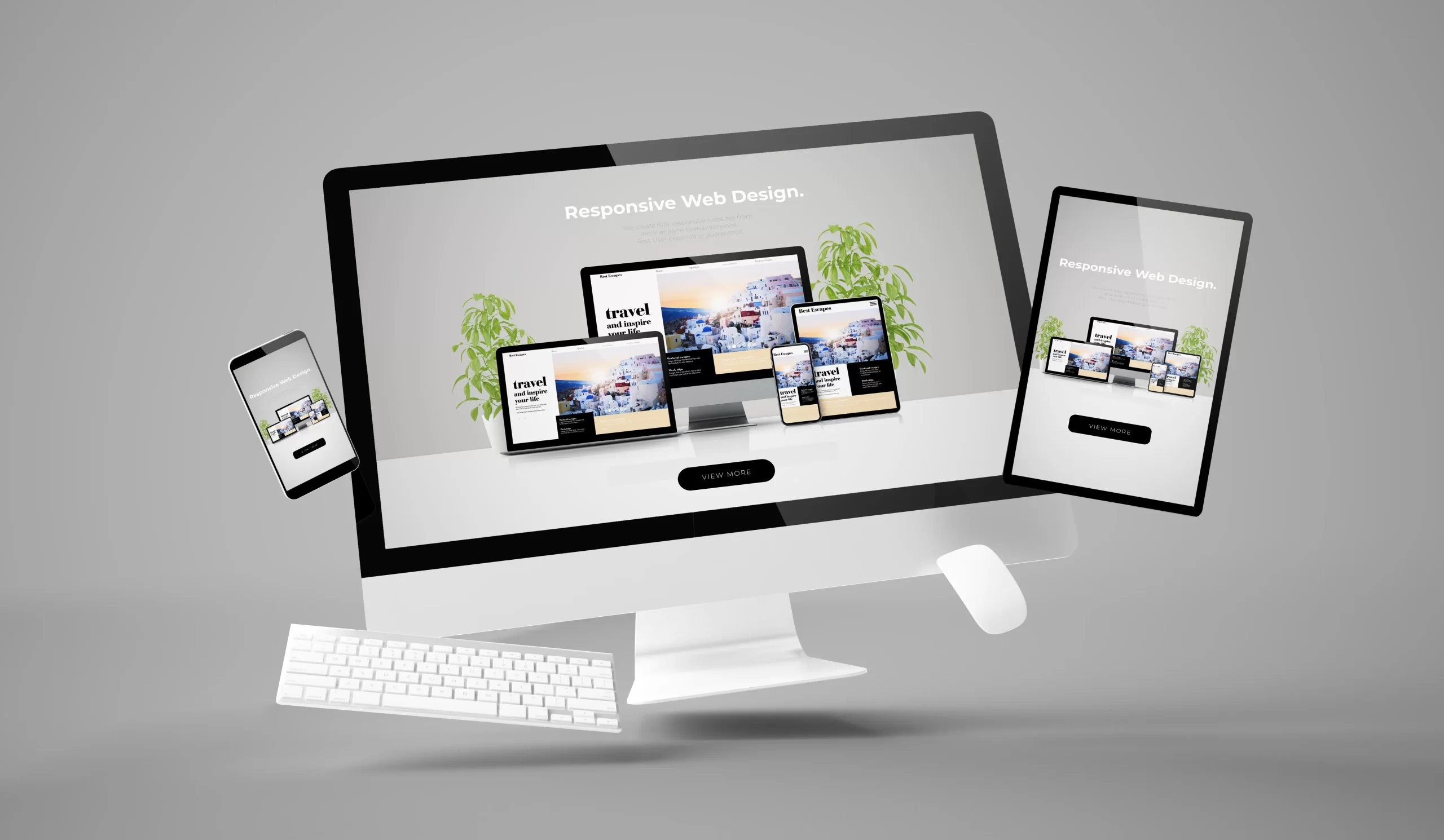
Responsive website design is a design approach that ensures a website automatically adapts to different screen sizes and devices. The content, layout, and visuals adjust seamlessly so users get the best possible experience no matter how they access your site. It is like having a digital chameleon that always looks right in its environment. Instead of creating separate versions for mobile and desktop, one flexible layout changes dynamically. This means faster updates, reduced maintenance, and consistent branding across all devices. Responsive web design examples can show you how leading brands use fluid grids, flexible images, and intelligent media queries to craft flawless user journeys.
Why It Matters for Modern Businesses
Consumers expect convenience. If your site takes too long to load or forces users to zoom in just to read your content, they will leave. Responsive website design eliminates these barriers, providing an effortless browsing experience that keeps visitors engaged. Moreover, search engines reward responsiveness. Google’s algorithms favor websites that perform well on mobile devices, which can help improve your ranking and visibility. A responsive site also supports social sharing, ensuring your content looks appealing when shared across platforms. For modern businesses, a responsive website is not only about design but about strategy. It communicates professionalism, enhances trust, and ensures your brand message is consistent across every digital touchpoint.
Learning Responsive Website Design
Learning responsive website design is one of the most valuable steps you can take to improve your online presence and digital skill set. It is not just about making a website look nice on a phone, it is about understanding how people interact with content across multiple devices and ensuring your design responds to their needs. To begin, it helps to start with the basics of HTML and CSS, since these are the building blocks of any website. Once you are comfortable with them, you can move into concepts like flexible grids, fluid layouts, and media queries, which are the foundation of responsive design.
For beginners, enrolling in a responsive web design course is a great way to learn in a structured and practical way. These courses often include step-by-step lessons, interactive examples, and real-world projects that teach you how to create adaptive websites from scratch. If you prefer reading, a responsive website design book can serve as an excellent companion, explaining the theory behind design principles and offering insights from experienced professionals.
You can also explore responsive web design freecodecamp, a free online learning platform that provides hands-on tutorials and exercises to help you build your first responsive website. It allows you to practice coding while understanding how each element contributes to adaptability and usability. As you progress, study responsive website design examples from real businesses and popular sites to see how they maintain visual harmony and functionality across different devices. With consistent learning and practice, you can master the art of creating websites that are not only visually appealing but also user-friendly, scalable, and future-ready.
FAQs
What is responsive web design?
Responsive website design is a method of building websites that automatically adjust their layout, content, and images based on the device being used. It ensures a smooth and consistent user experience across phones, tablets, and desktops, without the need for separate site versions.
How do I make my website responsive?
To make your website responsive, use flexible grid layouts, fluid images, and media queries in your code. These elements allow the site to adapt to different screen sizes. You can also use responsive templates or frameworks to simplify the process and then test your site on multiple devices.
What are the three basic things required for responsive website design?
The three core components are flexible grids, scalable images, and CSS media queries. Together, these create layouts that adjust fluidly to any screen width, ensuring both readability and functionality remain intact across all devices.
What is responsive website design skills?
Responsive website design skills include understanding CSS, HTML, and JavaScript, along with knowing how to use flexible layouts and media queries effectively. These skills help designers create adaptable, mobile-friendly websites that look and perform well everywhere.
Is responsive design UX or UI?
Responsive design connects both UX and UI. It enhances the user interface by adapting the layout for different screens, and it supports user experience by making interactions easy and enjoyable. Essentially, it bridges design aesthetics with usability.
Building Your Own Responsive Website
Building your own responsive website may sound challenging at first, but with the right approach and tools, it becomes an exciting and rewarding process. The first step is to plan your layout. Think about what content is most important to your visitors and how you want it to appear across different devices. Begin by sketching wireframes for desktop, tablet, and mobile views to visualize how your design will adapt. Once you have a clear structure, use flexible grids and percentages instead of fixed-width layouts. This ensures that elements automatically adjust as the screen size changes, maintaining a consistent flow and readability.
Next, focus on using fluid images and videos that scale proportionally. Fixed images can break layouts or slow loading times on smaller devices, so it is best to use CSS techniques that allow visuals to resize smoothly. Media queries are another key part of responsive website design, as they let you apply different styles depending on the user’s screen width. For example, you can set a specific font size for mobile users and another for desktop users, keeping the experience comfortable and clear.
If you are using a content management system like WordPress or Shopify, choose a responsive theme that is already optimized for various devices. For those building from scratch, frameworks like Bootstrap or CSS Grid can simplify the process. Always test your website on multiple devices and browsers to make sure everything loads correctly and looks professional. A successful responsive website should not only look appealing but also provide a smooth, intuitive experience for every visitor, no matter what device they use.
Examples of Responsive Web Design in Action
When done right, responsive website design transforms the user experience. Think of websites that adjust flawlessly whether viewed on a large desktop monitor or a small phone screen. Menus become intuitive, images resize perfectly, and text remains legible without constant zooming. Responsive website design examples often include businesses that use flexible grids and scalable visuals to create harmony between aesthetics and usability. The beauty lies in simplicity. Even with complex content, a well designed site feels effortless to explore. This helps retain visitors, lowers bounce rates, and encourages engagement.
In the end, a responsive website is more than just a technical trend. It is an essential part of building a credible online presence in today’s mobile driven world. By adopting responsive website design, modern businesses can reach a broader audience, provide better user experiences, and strengthen their overall brand identity. Whether you learn through a responsive web design book, a responsive website design course, or hands-on practice at responsive website design freecodecamp, the skills you gain will shape how people interact with your business online. In a fast changing digital landscape, being adaptable is not a choice, it is a strategy for success.


